Brightspace, our Learning Management System (LMS), was designed with accessibility in mind. However, it is the responsibility of the instructor and/or course designer to ensure their course content is formatted using best practices for accessibility; including the use of good heading structure, text formatting, contrast and color, descriptive links, alternative text, tables, lists, etc.
I am writing a series of accessibility related blog posts that will provide suggestions on how you can make small changes when creating course content to make it accessible. This is the second tip in my series of accessibility related blog posts and it focuses on text formatting.
Here are a few suggestions for making text legible for persons with a visual impairment and that work for nearly everyone.
| Contrast – Use the highest possible contrast for text | 
|
| Point Size – The relationship between readability and point size differs somewhat among typefaces. | 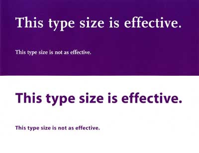
|
| Leading – Spacing between lines of text, should be at least 25 to 30 percent of the point size. | 
|
| Font Family – Avoid complicated, decorative or cursive fonts. When they must be used, reserve them for emphasis only. | 
|
| Sans-serif or standard serif fonts with familiar, easily recognizable characters are best. | 
|
| Font Style – Roman typeface, using upper and lower cases, is more readable than italics, oblique or condensed. | 
|
Some additional points to consider:
- Color should not be the only method used to convey information
- Avoid red or green text or text decoration, such as Word Art, Shadows, 3D, etc.
- Use bold or italic to display emphasis
- Do not underline text (screen readers interpret underlines as links)
- Avoid writing whole sentences in capital letters
- Avoid moving or blinking text
- Keep the number of fonts used to a minimum
- The reading order should be the same as the visual order
You will remove significant barriers for the visually impaired if you take these suggestions into consideration when creating course content. An added bonus is that there will be students without disabilities, as well as those who have chosen not to disclose their disability to you, who will find your use of these tips helpful as well.
If you are interested in getting more information about text formatting refer to "Making Text Legible" at Light House International.