Skip to content

celebrate GAAD heading with disability icons

Thursday, May 21st, is Global Accessibility Awareness Day (GAAD). GAAD aims to get you talking, thinking, and learning about digital access/inclusion and people with different abilities and talents.

Accessibility is about everyone. It is extremely important for students with disabilities to have access to accessible course content.

Video Notes is a built-in media recording tool in Brightspace that allows instructors and learners to record short videos with a webcam. This makes it easy to personalize the learning experience with short, video-based feedback, comments, or instructions. Video Notes can be added where video attachments are supported and when the HTML Editor’s Insert Stuff option is available.

People who are deaf or hard of hearing rely on captions and subtitles to understand video content. But there are a lot of other great reasons for using captions. For example, you may have some learners who choose not to use the sound or they cannot use it without disturbing those around them. You may have some learners who are not native in your language or who have trouble understanding you. Closed captions and subtitles will allow these individuals to receive your message and understand it.

Did you know you can generate automatic closed captions for newly created Video Notes AND you have the ability to manually add or edit closed captions for all previously recorded Video Notes?

Follow these steps to do it.

To generate automatic captions:

  1. Select Add Video Note from the Insert Stuff option in the HTML Editor.
  2. Click on New Recording, click Stop Recording when done recording.
  3. Click on Next
  4. Enter a title and description for the Video Note.
  5. Choose the audio language.
  6. Check the "Automatically generate captions from audio" box.
  7. Click Next and follow the prompts.
  8. After video processing, you can view the closed captions using video player controls.
example of automatically generate captions from audio checkbox
Video Notes - automatically generate captions from audio

Note: As with any automatically generated captions, you should verify the accuracy of the automatically generated captions.

To edit/update Video Note captions:

  1. Select Video Note Captions from the Admin Tools. Admin Tools are accessed from the cog icon in the top right corner of the page.
  2. Locate the Video Note you would like to review the captions for.
  3. Select the Video Note from the list.
  4. Edit the captions in the Captions Editor.
  5. Click on Save Captions.
Video Notes captions option shown on Admin Tools menu
Video Notes captions
Example of Video Notes captions editor
Video Notes - update automatic captions

To add Video Note captions:

  1. Select Video Note Captions from the Admin Tools. Admin Tools are accessed from the cog icon in the top right corner of the page.
  2. Locate the Video Note you would like to add captions to.
  3. Select the Video Note from the list.
  4. For automatic captions, select the audio language and then click Generate OR to upload a caption file, click Choose File, locate the captions file, click Upload.
  5. After video processing, you can view the closed captions using video player controls.
Example of adding captions to Video Notes
Video Notes - add captions

Reminder: As with any automatically generated captions, you should verify the accuracy of the automatically generated captions.

Want more information?

Brightspace Tip #102: Video Notes
Create Video Notes
Create and insert a Video Note in HTML Editor
Reuse Video Notes
Understanding the HTML Editor
Add closed captions to a Video Note
Edit Video Notes closed captions

View all the Brightspace training recaps
Brightspace Known Issues
Continuous Delivery release notes
Request a sandbox course
Sign-up for Brightspace training sessions
You can find Brightspace help at D2L's website.
Join the Brightspace Community.
Try these Brightspace How-To documents.
Visit our Brightspace FAQs for additional Brightspace information
or schedule a one-on-one session, email, or
call Janice Florent: (504) 520-7418.

Note: Are you doing something innovative in Brightspace or perhaps you've discovered a handy tip? Share how you are using Brightspace in your teaching and learning in The Orange Room.

Image credit: "celebrate GAAD" by jflorent is dedicated to the public domain under CC0 and is adaption of "disability symbols" by National Park Service in the public domain

celebrate GAAD heading with disability icons

Thursday, May 21st, is Global Accessibility Awareness Day (GAAD). GAAD aims to get you talking, thinking, and learning about digital access/inclusion and people with different abilities and talents.

Accessibility is about everyone. It is extremely important for students with disabilities to have access to accessible course content.

The Brightspace HTML Editor has a built-in accessibility checker that makes it easy to check for issues or offer suggestions to fix identified accessibility issues.

Follow these steps to do it.

To check for accessibility issues:

  1. After you add content to the HTML Editor, click the accessibility checker icon.
  2. HTML Editor accessibility checker icon

  3. The checker indicates if the content is free of accessibility issues, or offers suggestions to fix them.
  4. accessibility issues detected

Want more information?

Brightspace Accessibility Checker
Improve Your Course with Brightspace Accessibility Checker

View all the Brightspace training recaps
Brightspace Known Issues
Continuous Delivery release notes
Request a sandbox course
Sign-up for Brightspace training sessions
You can find Brightspace help at D2L's website.
Join the Brightspace Community.
Try these Brightspace How-To documents.
Visit our Brightspace FAQs for additional Brightspace information
or schedule a one-on-one session, email, or
call Janice Florent: (504) 520-7418.

Note: Are you doing something innovative in Brightspace or perhaps you've discovered a handy tip? Share how you are using Brightspace in your teaching and learning in The Orange Room.

Image credit: "celebrate GAAD" by jflorent is dedicated to the public domain under CC0 and is adaption of "disability symbols" by National Park Service in the public domain

GAAD logo

Thursday, May 21st, is Global Accessibility Awareness Day (GAAD). The purpose of GAAD is to get everyone talking, thinking and learning about digital (web, software, mobile, etc.) access/inclusion and people with different disabilities.

While people may be interested in the topic of making technology accessible and usable by persons with disabilities, the reality is that they often do not know how or where to start. Awareness comes first.

The key to embracing accessibility – whether online, in the classroom, or on campus is realizing that taking the time to address an issue doesn’t just help a handful of individuals; in the end, everyone benefits.

Participants in global accessibility awareness day are encouraged to attempt to go an hour without using a technology most people take for granted – such as not using a computer mouse, attempting to navigate a website using a screen reader, or enlarging all of the fonts in a web browser to 200 percent, to see how functionality may be lost when accessibility isn’t taken into consideration in the design.

Whether you participate in an organized activity with others or not, join in and take an hour out of your day to experience digital accessibility first-hand.

Image credit: "Global Accessibility Awareness Day logo" by Mindymorgan licensed under CC BY-SA 4.0

Brightspace, our Learning Management System (LMS), was designed with accessibility in mind. However, it is the responsibility of the instructor and/or course designer to ensure their course content is formatted using best practices for accessibility; including the use of good heading structure, text formatting, contrast and color, descriptive links, alternative text, tables, lists, etc.

I am writing a series of accessibility related blog posts that will provide suggestions on how you can make small changes when creating course content to make it accessible. This is the seventh tip in my series of accessibility related blog posts and it focuses on tables.

A table is a means of arranging information into rows and columns. Tables are very useful for displaying data in an organized manner. Your course schedule and office hours are examples where formatting this information in a table could make the it more accessible.

Tables should be avoided when you want to simply format other content (i.e., just to line things up neatly.) Using tables just for layout purposes is not the best practice for accessibility and may make it nearly impossible for people who use assistive technologies to access the information. If you do choose to use a table to layout text on the page, make sure you lay it out so it will make sense when read from left to right. Text-to-speech software by default will read the information in a table left to right, cell by cell, and row by row.

This video shows how a screen reader reads information in tables. There is an example of a good and a bad table layout. The video demonstrates how reading order AND the information in the columns are important considerations when creating accessible tables.

In the bad example in the video, the use of the dash and abbreviations for the months can be confusing when read by a screen reader. The abbreviated months would have been less confusing if the year had been included. The use of 1,2,3 in the "Week" column in the bad example can be confusing as well. A better option is to use Week 1, Week 2, Week 3 in the respective column.

When creating tables, read your table left to right, top to bottom (never repeating a cell). Does it make sense? Keep in mind that a screen reader will read tables in this way. If it doesn't make sense, you should reorganize the table so that it makes sense when read left to right, top to bottom without repeating a cell.

Consider these examples of accessible tables:

example of accessible tables

The tables, in the examples above, make sense when read left to right, top to bottom, without repeating a cell.

Follow these tips when creating tables to make them accessible:

  • Do not use tabs or spaces to create tables. It may look like a table; however it will not be recognized as a table and can be confusing when read by assistive technologies.
  • Add Row and Column Headers to tables to distinguish the heading text from the data area of the table. Screen readers read simple tables efficiently when the column or row headers are clearly defined.
  • Repeat Row Headers if the table spans more than one page. Tables that are contained on multiple pages should have the header row repeated on each page.
  • When you use tables for the presentation of data, summarize the table to aid reader comprehension. This helps all students to know the high points of a table.
  • Break up complex tables (nested tables and merged or split cells inside of tables) into a series of simple tables. Simple tables are more usable for everyone.
  • The information in each cell should make sense if read without the column heading. For example, instead of entering 1, 2, 3, in a "Chapter" column you should enter Chapter 1, Chapter 2, Chapter 3, in the cells to make it clearer when read by a screen reader.

When applying structure to documents and web content, you should use the appropriate built-in formatting structure tools to do so. Doing so will make content accessible to everyone, including users of assistive technology.

Creating tables in MS Word 2013:

  1. On the Insert tab choose Insert Table and select the appropriate number of rows and columns for your table.
  2. Select the header row in the table and press the right mouse button. A Table Properties window will open.
  3. Select the Row tab and check the box next to Repeat as header row at the top of each page. Press Enter key or Ok button. This header row will be repeated at top of each page.

insert table in MS Word

Creating tables in PowerPoint 2013:

  1. Use the Insert Table function in the Slide layout select the appropriate number of rows and columns for your table.

insert table from placeholder in PowerPoint

You can also insert a table

  1. From the Insert tab, click the Table command.
  2. A drop-down menu containing a grid of squares will appear. Hover the mouse over the grid to select the number of columns and rows in the table.

insert table in PowerPoint

Working with tables in the Brightspace HTML Editor:

To create a table in the HTML Editor:

  1. Click the insert/edit table function and select the appropriate number of rows and columns for your table to begin adding a table in the text area.
HTML Editor - table formatting options
HTML Editor - Table formatting options

To create column headers:

  1. Put your cursor in one of the cells you want to mark up as a table header.
  2. Then click on the drop-down menu next to the Table icon in the toolbar.
  3. Choose Cell Properties. The Cell properties window will pop-up.
  4. In the Cell type field, click on the drop-down list and select Column Header.
  5. Click Update. You will know you have successfully changed the row to table headers because the look of the table cells will change.
  6. Repeat for each cell that is a column header.
create column header in HTML Editor
HTML Editor - Create column header

You will remove significant barriers for users of assistive technology if you take these suggestions into consideration when creating course content. An added bonus is that if you include properly structured tables when creating your course content you will be ahead of the game in the event you do have a student who requires the use of assistive technology. Remember a properly structured table is good design and can benefit everyone.

Additional information about tables can be found here:

Brightspace, our Learning Management System (LMS), was designed with accessibility in mind. However, it is the responsibility of the instructor and/or course designer to ensure their course content is formatted using best practices for accessibility; including the use of good heading structure, text formatting, contrast and color, descriptive links, alternative text, tables, lists, etc.

I am writing a series of accessibility related blog posts that will provide suggestions on how you can make small changes when creating course content to make it accessible. This is the sixth tip in my series of accessibility related blog posts and it focuses on lists.

A list is a set of items that share a purpose and/or have common characteristics. Lists are great from an accessibility standpoint because they provide structured order to content in a linear fashion.

Properly structured lists help to identify order and hierarchy in documents and web content. Lists that are properly formatted allow all users, especially those using assistive technology, to identify and navigate through a related group of items. List items that are not properly formed or grouped may not be translated properly by assistive technology.

bulleted list

Unordered (bulleted) lists should be used when there is no order of sequence or importance. Ordered (numbered) lists suggest a progression or sequence.

Compound lists contain multiple levels of classification. For example, a compound home improvement list would have items organized by category (e.g. electrical, hardware, flooring, plumbing.) With compound lists, relationships are shown visually using indents and different item markers (i.e., bullets, numbers, letters, etc.).

Compound lists may be difficult for visual users to decipher if the visual cues are insufficient. Also, compound lists may be disorienting for nonvisual users. Use a simple list structure whenever possible.

As with headings, lists should be used correctly and for the right purposes. Lists should never be used for merely indenting or other layout purposes.

When lists are formatted using asterisks, hyphens or images to create the look of bullets in a document, users of assistive technology are not able to detect the hierarchical structure and relationship of the list items. You should never rely on indentation to provide a visual list, use the proper structure instead.

Lists should be created using the built-in tools for ordered (numbered) and unordered (bulleted) lists. Without using these tools, a list is not really a list, which makes the content more difficult for assistive technology users to fully understand.

Creating lists in MS Word and PowerPoint 2013:

  1. Select the text that you want to add bullets or numbering to.
  2. On the Home tab, under Paragraph, select the appropriate bullet from the list.

create list in MS Word

Creating lists in Google Docs and Slides:

  1. On your computer, open a document or presentation in Google Docs or Slides
  2. Click a page or slide where you want to add a list
  3. In the toolbar, choose a list type. If you don't see the option, click More ...
  4. Start typing your text for the list

create list in Google Docs

Creating lists in the Brightspace HTML Editor:

  1. In the HTML Editor, select the text that you want to add bullets or numbering to
  2. Select the unordered list or ordered list button

create list in HTML Editor

You will remove significant barriers for users of assistive technology if you take these suggestions into consideration when creating course content. An added bonus is that if you include properly structured lists when creating your course content you will be ahead of the game in the event you do have a student who requires the use of assistive technology.

Additional information about lists can be found here:
Learn how to create lists in Word 2013
Learn how to create lists in Word 2016
Learn how to create lists in PowerPoint 2013
Learn how to create lists in PowerPoint 2016

1

Brightspace, our Learning Management System (LMS), was designed with accessibility in mind. However, it is the responsibility of the instructor and/or course designer to ensure their course content is formatted using best practices for accessibility; including the use of good heading structure, text formatting, contrast and color, descriptive links, alternative text, tables, lists, etc.

I am writing a series of accessibility related blog posts that will provide suggestions on how you can make small changes when creating course content to make it accessible. This is the fifth tip in my series of accessibility related blog posts and it focuses on when alt text (alternative text) is not enough.

Computers can read text on a screen but images, graphs, and charts are meaningless to visually impaired users. Alternative text (alt text) is an alternate method for supplying information about images, graphs, and charts to users who are visually impaired.

example of a infographic

Example of an infographic

example of a infographic

Example of an infographic

Alt text should describe the important contents of an image that a user who cannot see an image would need to know, such as text, numbers, and other data. Describing colors, location of objects, and other visuals is only needed when necessary to understanding the image.

complex images, graphs, and charts require more detailed description than the limited one or two brief sentences that are used in the alt text

Adding alt text to images, graphs, and charts is an important part of making them accessible. Most images, graphs, and charts can be made accessible using alt text descriptions. However, complex images, graphs, and charts require more detailed description than the limited one or two brief sentences that are used in the alt text.

example of a complex data visualization

Example of a complex data visualization

What should you do when you have a complex image, graph, or chart whose meaning cannot be conveyed with alt text alone? There are several ways to handle complex images where a short description is not possible. The best solution is to include a thorough description of the complex image in the content of the page, immediately before or after the image. If you don’t want to add more content to your page, another preferred alternative is to create another web page with the thorough description of the complex image and link to it near the image.

You may be wondering what exactly should you include in the thorough description. The Diagram Center (Digital Image And Graphic Resources for Accessible Materials) is an excellent resource that provides comprehensive guidelines to make it easier for you to make complex images accessible to all learners.

Here are a few additional resources to help you with describing complex images:

It is extremely important for students with disabilities to have access to accessible course content. Describing complex images utilizing these tips is good course design. Even though you may not have a student with a disability currently enrolled in your course, you will find students without disabilities will take advantage of accessible content as well.

Image Credits:
"False Food Myths Infographic 2012" by USDAgov is licensed under CC BY 2.0
"Apple v Android infographic" by by Andrew Rees is licensed under CC BY-NC 4.0
"Complex example of data visualization" by Aigner and Yi is licensed under CC BY

1

Brightspace, our Learning Management System (LMS), was designed with accessibility in mind. However, it is the responsibility of the instructor and/or course designer to ensure their course content is formatted using best practices for accessibility; including the use of good heading structure, text formatting, contrast and color, descriptive links, alternative text, tables, lists, etc.

I am writing a series of accessibility related blog posts that will provide suggestions on how you can make small changes when creating course content to make it accessible. This is the fourth tip in my series of accessibility related blog posts and it focuses on alternative text (alt text).

blind female student listening to screen reader describe information on his computer screen

Computers can read text on a screen but images, graphs, and charts are meaningless to visually impaired users. Alt text is an alternate method for supplying information about images to users who are visually impaired.

Alt text is important for screen reader users because a screen reader cannot describe an image. Since screen reader software cannot interpret images, it relies on alt text to communicate image information to the user. When an image does not have alt text the only information the screen reader can relay is that there is an image on the page and provide the file name for the image.

Alt text should describe an image so it makes sense in context. If a picture is worth a thousand words, then a short alt text description may be a poor substitute. While a concise alt text description is important, the alt text should be less than 125 characters. You want to think about what is the most important information you are trying to get across with the image and stay within the 124 or less characters. If the image requires a lengthy description, you should describe the image in the content of the page.

There are several ways to handle complex images (e.g. charts, data, statistics, etc.) where a short description is not possible. The best solution is to include a thorough description of the complex image in the content of the page, immediately before or after the image. If you don't want to add more content to your page, another preferred alternative would be to create another web page with just a description of the complex image and link to it near the image. Additionally, text descriptions of graphs and charts can help all students understand difficult concepts.

How alt text is written will vary depending on the type of image. Most screen reader software announces the presence of an image by appending a word such as "graphic" to the alt text, so using words such as "image" "graphic" and "photo" are unnecessary in the alt text, unless it helps to convey further meaning important for a user to know.

Consider this example which uses “Guide Dog and Man” as the alt text:

example of incorrect use of alt text

The alt text “Guide Dog and Man” is not effective if the intent is to show the dynamic action of guiding in the picture. In this situation a better alt text description is “A guide dog leads the way with her handler holding the guide harness in his left hand” as shown in the following example:

example of correct use of alt text

There is no need to include "image of," "picture of," or "photo of" in the alt text in this example because the screen reader will announce the presence of the image.

Additionally, images that contain text (as in a logo) should generally be coded to just include that text as the alt text.

Many images are used only for visual interest, they aren't meant to convey any meaning or important information. In this case, it is best to use what is called NULL alt text or empty alt text. This is done by entering two quotes ("") with no spaces in between in the alt text box.

So, how can you add alt text to images? Listed below are instructions on adding alt text in MS Word documents, PowerPoint presentations, Google Docs and Slides, as well as in Brightspace.

Add Alt Text to image in MS Word and PowerPoint 2013:

  1. PC users: right-click on an image
    Mac users: press control key and click on the image
  2. Select Format Picture
  3. Select the option for Alt Text
  4. Type your alt text in the description field. Leave the Title field blank.

example of alt text in MS Word and PowerPoint

Add Alt Text to image in Google Docs and Slides:

  1. PC users: right-click on an image
    Mac users: press control key and click on the image
  2. Select Alt text
  3. Enter title and description
  4. Click Ok

example of alt text in Google Docs

Add Alt Text to image in Brightspace:

When adding an image you will be prompted to provide alternative text. Enter the ALT Text in the Alternative Text field. When an image is decorative, simply check the image is decorative box.

example of alt text in HTML Editor

You will remove significant barriers for the visually impaired if you take these suggestions for adding alt text into consideration when creating course content. An added bonus is that if you take the extra step to include alt text when creating your course content you will be ahead of the game in the event you do have a visually impaired student.

Additional information about alt text can be found at:

Image credit:
"Stephanie using visual impairment simulation glasses" by emilylocaldigital is licensed under CC BY-NC-SA 2.0

Updated: 9/26/2021

Brightspace, our Learning Management System (LMS), was designed with accessibility in mind. However, it is the responsibility of the instructor and/or course designer to ensure their course content is formatted using best practices for accessibility; including the use of good heading structure, text formatting, contrast and color, descriptive links, alternative text, tables, lists, etc.

I am writing a series of accessibility related blog posts that will provide suggestions on how you can make small changes when creating course content to make it accessible. This is the third tip in my series of accessibility related blog posts and it focuses on descriptive links.

signpost

Links are like sign posts. They should tell you what you will find when you follow them. When using a computer, people are generally skimming pages for links. They tend to skim pages to quickly find what they are looking for.

Text links on a page are easily identifiable to persons who are not visually impaired because they are normally colored and underlined, and therefore stand out from the other information on the page.

Persons with a visual impairment using screen reader software are presented with a “links list” with all the available links found on the page. Screen reader users and persons using text-to-speech browsers often navigate websites going from link to link using the tab key, so providing descriptive links is extremely important.

Link text stands out in the same way that bold text does. If all your links have non-descriptive link text like "click here" or "more information" users are forced to read the text around the link to understand the context of the link and where it will take them. Therefore "click here" and “more information” are more of a hindrance than a help.

non-descriptive link text example

For effective skimming, both visual and non-visual users benefit from link text that can stand on its own without the surrounding context of the page. Good link text provides a clear description of the page that will load when following a link. With good descriptive link text, users can skim links and make quick informed decisions about the path to take to accomplish their task. With non-descriptive link text, users cannot ascertain where the link will take them from the link text alone. Therefore, you should avoid non-descriptive link text such as:

  • Click here
  • Here
  • More information
  • Read more
  • Continue

These types of non-descriptive link text offer no explanation and require users to expand their focus to the surrounding context or follow the link to discover its destination.

Consider this example of a list of all the links on a page that a visually impaired user has pulled up for quick access.

useless, non descriptive link text in link list

As you can see, the list of non descriptive links is meaningless. Descriptive links as shown in the image below are far more useful.

descriptive, meaningful link text in link list

When choosing descriptive links the link text needs to be long enough to convey the purpose of the link and no longer. Make link text clear and self-explanatory to support quick and effective navigation.

descriptive link example

When scanning links, the first words in the link text are the ones most likely to grab the user’s attention. Link text that begins with keywords is easier to scan efficiently and works better with software features like "link lists" that visually impaired individuals use to get an alphabetized list of links on a page.

Links beginning with non-descriptive words are not very helpful. Consider these two examples "All about ocean acidification" and "Learn more about global warming." Scanning these links will be slower and the alphabetized links list is not going to be very useful. A better approach is to use only the keywords for link text. For example those two links could be improved if they were formatted as "All about ocean acidification" and "Learn more about global warming."

example of descriptive links

Some users make links out of entire sentences or entire paragraphs. These long links are probably unnecessary and are not user-friendly for screen reader users. Remember that screen reader users cannot visually scan through lengthy links. They have to listen to the entire text. Some screen reader users get frustrated with long link text and move on to the next link if they cannot understand the purpose of the link after the first few words.

URLs are not always human-readable or screen reader friendly and therefore using URLs as link text should usually be avoided. Exceptions are when the document is intended to be printed or if the URL is relevant content.

In most cases, it is better to use human-readable text instead of the URL. The human-readable link Inclusive Design for a Digital World is more user-friendly than the link to purchase the book by the same title on Amazon.com, which consists of this 170-character link full of letters, numbers, slashes, and text that is not very human-readable (https://www.amazon.com/Inclusive-Design-Digital-World-Accessibility/dp/148425015X/ref=sr_1_1?keywords=Inclusive+Design+for+a+Digital+World&qid=1563708616&s=audible&sr=8-1.)

Additionally, links don't always lead to web pages. It is equally important to make this clear in your link text. Users appreciate knowing in advance, for example, that if they click on a link on their mobile device they will download a 20Mb PDF. In this case, the link text should indicate that it is a link to a file, including type and size of the file. Here's an example: Assignments Tool Quick Reference Guide (pdf 587KB).

Hyperlinks that are good for both accessibility and usabilty use descriptive text and retain the standard underline style.

Example: Descriptive Links
Ugly (and unclickable): https://webaim.org/techniques/hypertext/link_text
Bad: Click here to learn more.
Good: Accessible link text and appearance by WebAIM

Writing good link text isn't difficult. If you take these tips for creating descriptive links into consideration when creating course content, you will remove significant barriers for the visually impaired. An added bonus is that there will be students without disabilities, as well as those who have chosen not to disclose their disability to you who will find your use of these tips helpful as well.

If you are interested in getting more information about descriptive links refer to “Link Text” at webaim.org.

Image credit: image by from Pixabay

Brightspace, our Learning Management System (LMS), was designed with accessibility in mind. However, it is the responsibility of the instructor and/or course designer to ensure their course content is formatted using best practices for accessibility; including the use of good heading structure, text formatting, contrast and color, descriptive links, alternative text, tables, lists, etc.

I am writing a series of accessibility related blog posts that will provide suggestions on how you can make small changes when creating course content to make it accessible. This is the second tip in my series of accessibility related blog posts and it focuses on text formatting.

Here are a few suggestions for making text legible for persons with a visual impairment and that work for nearly everyone.

Contrast – Use the highest possible contrast for text image showing contrasting text that is effective and text that is not effective

Point Size – The relationship between readability and point size differs somewhat among typefaces. image showing font point size that is effective and point size that is not effective

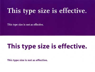
Leading – Spacing between lines of text, should be at least 25 to 30 percent of the point size. image showing leading that is effective and leading that is not effective

Font Family – Avoid complicated, decorative or cursive fonts. When they must be used, reserve them for emphasis only. image showing times roman font family as a font that is more effective than a decorative font family

Sans-serif or standard serif fonts with familiar, easily recognizable characters are best. image showing difference between serif and san-serif fonts

Font Style – Roman typeface, using upper and lower cases, is more readable than italics, oblique or condensed. image showing font style that is effective and font style that is not effective

Also, you should ensure that your text is selectable. Text that can be selected with a cursor is accessible to screen readers and other assistive technology. Images of text, such as word art, screenshots, or infographics are not accessible. A screen reader can not read the text in images. If you must include non-selectable text, also provide a text alternative.

Some additional points to consider:

  • Color should not be the only method used to convey information
  • Avoid red or green text or text decoration, such as Word Art, Shadows, 3D, etc.
  • Use bold or italic to display emphasis
  • Do not underline text (screen readers interpret underlines as links)
  • Avoid writing whole sentences in capital letters
  • Avoid moving or blinking text
  • Keep the number of fonts used to a minimum
  • The reading order should be the same as the visual order

You will remove significant barriers for the visually impaired if you take these suggestions into consideration when creating course content. An added bonus is that there will be students without disabilities, as well as those who have chosen not to disclose their disability to you, who will find your use of these tips helpful as well.

If you are interested in getting more information about text formatting refer to "Making Text Legible" at Light House International.

two visually impaired persons using computers

This is the first in a series of blog posts that is a follow-up to my recent The Importance of Accessibility in Education post where I wrote,

Even though you may not have a student with a disability currently enrolled in your course, there are a few things you can do when creating content that will save you time later when you do have a student with a disability. This is not wasted time as you will find some students without disabilities will take advantage of accessible content as well.

Brightspace, our Learning Management System (LMS), was designed with accessibility in mind. However, it is the responsibility of the instructor and/or course designer to ensure their course content is formatted using best practices for accessibility; including the use of good heading structure, text formatting, contrast and color, descriptive links, alternative text, tables, lists, etc.

This post will focus on headings. A good heading structure is an important accessibility consideration. Headings should be used to indicate main points and sub-points on a page. Like an outline, heading levels should appear in logical and consistent order.

Headings allow screen reader users to easily navigate through the page and can make the page more usable for everyone.

typewritten sheet of paper with headings

When creating documents, many people do not use true "heading styles." For example, when creating a heading, they simply change the font type, enlarge the font size, change the color, make it bold, etc. When this is done, the document has no real structure that can be detected by a screen reader program. While visual learners can scan the page for text that stands out from the rest, users who rely on a screen reader are not able to "see" these elements.

The correct way to provide structure for accessibility purposes is to use heading styles. Listed below are instructions on applying heading styles in MS Word, PowerPoint, Google Docs, Google Slides, and the HTML Editor in Brightspace.

Add heading styles in MS Word document:

  1. Click on the Home tab.
  2. Highlight the text.
  3. Click on the appropriate heading selector in the styles panel (e.g. Heading 1 for top-level heading).
image of MS Word ribbon showing headings

Add heading styles in PowerPoint:

Using slide layouts will ensure that files have correctly structured headings and lists, and proper reading order. To assign a Slide Layout:

  1. Click on the Home tab.
  2. Click on New Slide.
  3. Choose the desired layout from the slide options menu.
PowerPoint ribbon showing slide layouts

Add heading styles in Google Docs:

  1. Highlight the text.
  2. Click on the appropriate heading selector in the styles panel (e.g. Heading 1 for top-level heading).
Google Docs formatting tab

Add heading styles in Google Slides:

Use predefined layouts instead of manually created text boxes, because the layouts are specially coded to work well with adaptive technologies like screen readers. To assign a Slide Layout:

  1. Click on New Slide with Layout button.
  2. Choose the desired layout from the slide options menu.
Google Slides, slide layouts

Add heading styles in the Brightspace HTML Editor:

  1. Highlight the text.
  2. Select the proper heading level from the Format dropdown menu (e.g. H1 - Heading 1 for top-level heading; H2 - Heading 2 for a subheading of the top-level heading, etc.).

HTML Editor showing format dropdown

Note: When creating heading styles always use the proper heading level. Create uniform headings so that a screen reader can navigate the content and can understand how it is structured.

Additionally, you can customize styles.
Learn how to change styles in MS Word 2016
Learn how to change styles in MS Word 2013
Learn how to change a style set in MS Word 2010
Learn more about PowerPoint 2016 slide layouts
Learn more about PowerPoint 2013 slide layouts
Learn more about PowerPoint 2010 slide layouts

The National Center on Disability and Access to Education developed Accessibility Cheatsheets to assist anyone who is creating accessible content. These free resources are catered to less-technical individuals.

Image credit: "Digital Literacy for visually impaired" by IAPB/VISION 2020 is licensed under CC BY-NC-SA 2.0