Thursday, May 18th, is Global Accessibility Awareness Day (GAAD). GAAD aims to get you talking, thinking, and learning about digital access/inclusion and people with different abilities and talents.
Accessibility is about everyone. It is extremely important for students with disabilities to have access to accessible course content.
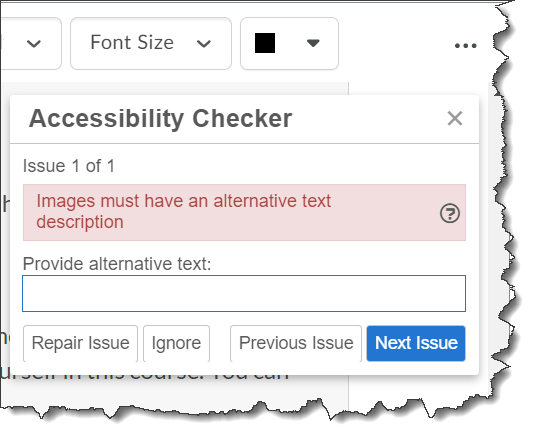
The Brightspace Editor has a built-in accessibility checker that makes it easy to check for issues or offer suggestions to fix identified accessibility issues.
Follow these steps to do it.
To check for accessibility issues:
After you add content to the Brightspace Editor, click the accessibility checker icon.
The checker indicates if the content is free of accessibility issues, or offers suggestions to fix them.
Note: Are you doing something innovative in Brightspace or perhaps you've discovered a handy tip? Share how you are using Brightspace in your teaching and learning in The Orange Room.
Thursday, May 18th, is Global Accessibility Awareness Day (GAAD). The purpose of GAAD is to get everyone talking, thinking and learning about digital (web, software, mobile, etc.) access/inclusion and people with different disabilities.
While people may be interested in the topic of making technology accessible and usable by persons with disabilities, the reality is that they often do not know how or where to start. Awareness comes first.
The key to embracing accessibility – whether online, in the classroom, or on campus is realizing that taking the time to address an issue doesn’t just help a handful of individuals; in the end, everyone benefits.
Participants in global accessibility awareness day are encouraged to attempt to go an hour without using a technology most people take for granted – such as not using a computer mouse, attempting to navigate a website using a screen reader, or enlarging all of the fonts in a web browser to 200 percent, to see how functionality may be lost when accessibility isn’t taken into consideration in the design.
Thursday, May 19th, is Global Accessibility Awareness Day (GAAD). GAAD aims to get you talking, thinking, and learning about digital access/inclusion and people with different abilities and talents.
Accessibility is about everyone. It is extremely important for students with disabilities to have access to accessible course content.
Video Notes is a built-in media recording tool in Brightspace that allows instructors and learners to record short videos with a webcam. This makes it easy to personalize the learning experience with short, video-based feedback, comments, or instructions. Video Notes can be added where video attachments are supported and when the Brightspace Editor’s Insert Stuff option is available.
People who are deaf or hard of hearing rely on captions and subtitles to understand video content. But there are a lot of other great reasons for using captions. For example, you may have some learners who choose not to use the sound or they cannot use it without disturbing those around them. You may have some learners who are not native in your language or who have trouble understanding you. Closed captions and subtitles will allow these individuals to receive your message and understand it.
Did you know you can generate automatic closed captions for newly created Video Notes AND you have the ability to manually add or edit closed captions for all previously recorded Video Notes?
Note: Are you doing something innovative in Brightspace or perhaps you've discovered a handy tip? Share how you are using Brightspace in your teaching and learning in The Orange Room.
Thursday, May 19th, is Global Accessibility Awareness Day (GAAD). GAAD aims to get you talking, thinking, and learning about digital access/inclusion and people with different abilities and talents.
Accessibility is about everyone. It is extremely important for students with disabilities to have access to accessible course content.
The Brightspace Editor has a built-in accessibility checker that makes it easy to check for issues or offer suggestions to fix identified accessibility issues.
Follow these steps to do it.
To check for accessibility issues:
After you add content to the Brightspace Editor, click the accessibility checker icon.
The checker indicates if the content is free of accessibility issues, or offers suggestions to fix them.
Note: Are you doing something innovative in Brightspace or perhaps you've discovered a handy tip? Share how you are using Brightspace in your teaching and learning in The Orange Room.
Thursday, May 19th, is Global Accessibility Awareness Day (GAAD). The purpose of GAAD is to get everyone talking, thinking and learning about digital (web, software, mobile, etc.) access/inclusion and people with different disabilities.
While people may be interested in the topic of making technology accessible and usable by persons with disabilities, the reality is that they often do not know how or where to start. Awareness comes first.
The key to embracing accessibility – whether online, in the classroom, or on campus is realizing that taking the time to address an issue doesn’t just help a handful of individuals; in the end, everyone benefits.
Participants in global accessibility awareness day are encouraged to attempt to go an hour without using a technology most people take for granted – such as not using a computer mouse, attempting to navigate a website using a screen reader, or enlarging all of the fonts in a web browser to 200 percent, to see how functionality may be lost when accessibility isn’t taken into consideration in the design.
Accessibility is about everyone. It is extremely important for students with disabilities to have access to accessible course content.
Video Notes is a built-in media recording tool in Brightspace that allows instructors and learners to record short videos with a webcam. This makes it easy to personalize the learning experience with short, video-based feedback, comments, or instructions. Video Notes can be added where video attachments are supported and when the Brightspace Editor’s Insert Stuff option is available.
People who are deaf or hard of hearing rely on captions and subtitles to understand video content. But there are a lot of other great reasons for using captions. For example, you may have some learners who choose not to use the sound or they cannot use it without disturbing those around them. You may have some learners who are not native in your language or who have trouble understanding you. Closed captions and subtitles will allow these individuals to receive your message and understand it.
Did you know you can generate automatic closed captions for newly created Video Notes AND you have the ability to manually add or edit closed captions for all previously recorded Video Notes?
Note: Are you doing something innovative in Brightspace or perhaps you've discovered a handy tip? Share how you are using Brightspace in your teaching and learning in The Orange Room.
Thursday, May 20th, is Global Accessibility Awareness Day (GAAD). GAAD aims to get you talking, thinking, and learning about digital access/inclusion and people with different abilities and talents.
Accessibility is about everyone. It is extremely important for students with disabilities to have access to accessible course content.
Video Notes is a built-in media recording tool in Brightspace that allows instructors and learners to record short videos with a webcam. This makes it easy to personalize the learning experience with short, video-based feedback, comments, or instructions. Video Notes can be added where video attachments are supported and when the Brightspace Editor’s Insert Stuff option is available.
People who are deaf or hard of hearing rely on captions and subtitles to understand video content. But there are a lot of other great reasons for using captions. For example, you may have some learners who choose not to use the sound or they cannot use it without disturbing those around them. You may have some learners who are not native in your language or who have trouble understanding you. Closed captions and subtitles will allow these individuals to receive your message and understand it.
Did you know you can generate automatic closed captions for newly created Video Notes AND you have the ability to manually add or edit closed captions for all previously recorded Video Notes?
Click on New Recording, click Stop Recording when done recording.
Click on Next
Enter a title and description for the Video Note.
Choose the audio language.
Check the "Automatically generate captions from audio" box.
Click Next and follow the prompts.
After video processing, you can view the closed captions using video player controls.
Video Notes - automatically generate captions from audio
Note: As with any automatically generated captions, you should verify the accuracy of the automatically generated captions.
To edit/update Video Note captions:
Select Video Note Captions from the Admin Tools. Admin Tools are accessed from the cog icon in the top right corner of the page.
Locate the Video Note you would like to review the captions for.
Select the Video Note from the list.
Edit the captions in the Captions Editor.
Click on Save Captions.
Video Notes captionsVideo Notes - update automatic captions
To add Video Note captions:
Select Video Note Captions from the Admin Tools. Admin Tools are accessed from the cog icon in the top right corner of the page.
Locate the Video Note you would like to add captions to.
Select the Video Note from the list.
For automatic captions, select the audio language and then click Generate OR to upload a caption file, click Choose File, locate the captions file, click Upload.
After video processing, you can view the closed captions using video player controls.
Video Notes - add captions
Reminder: As with any automatically generated captions, you should verify the accuracy of the automatically generated captions.
Note: Are you doing something innovative in Brightspace or perhaps you've discovered a handy tip? Share how you are using Brightspace in your teaching and learning in The Orange Room.
Thursday, May 20th, is Global Accessibility Awareness Day (GAAD). GAAD aims to get you talking, thinking, and learning about digital access/inclusion and people with different abilities and talents.
Accessibility is about everyone. It is extremely important for students with disabilities to have access to accessible course content.
The Brightspace HTML Editor has a built-in accessibility checker that makes it easy to check for issues or offer suggestions to fix identified accessibility issues.
Follow these steps to do it.
To check for accessibility issues:
After you add content to the HTML Editor, click the accessibility checker icon.
The checker indicates if the content is free of accessibility issues, or offers suggestions to fix them.
Note: Are you doing something innovative in Brightspace or perhaps you've discovered a handy tip? Share how you are using Brightspace in your teaching and learning in The Orange Room.
Thursday, May 20th, is Global Accessibility Awareness Day (GAAD). The purpose of GAAD is to get everyone talking, thinking and learning about digital (web, software, mobile, etc.) access/inclusion and people with different disabilities.
While people may be interested in the topic of making technology accessible and usable by persons with disabilities, the reality is that they often do not know how or where to start. Awareness comes first.
The key to embracing accessibility – whether online, in the classroom, or on campus is realizing that taking the time to address an issue doesn’t just help a handful of individuals; in the end, everyone benefits.
Participants in global accessibility awareness day are encouraged to attempt to go an hour without using a technology most people take for granted – such as not using a computer mouse, attempting to navigate a website using a screen reader, or enlarging all of the fonts in a web browser to 200 percent, to see how functionality may be lost when accessibility isn’t taken into consideration in the design.
Thursday, May 21st, is Global Accessibility Awareness Day (GAAD). GAAD aims to get you talking, thinking, and learning about digital access/inclusion and people with different abilities and talents.
Accessibility is about everyone. It is extremely important for students with disabilities to have access to accessible course content.
Video Notes is a built-in media recording tool in Brightspace that allows instructors and learners to record short videos with a webcam. This makes it easy to personalize the learning experience with short, video-based feedback, comments, or instructions. Video Notes can be added where video attachments are supported and when the HTML Editor’s Insert Stuff option is available.
People who are deaf or hard of hearing rely on captions and subtitles to understand video content. But there are a lot of other great reasons for using captions. For example, you may have some learners who choose not to use the sound or they cannot use it without disturbing those around them. You may have some learners who are not native in your language or who have trouble understanding you. Closed captions and subtitles will allow these individuals to receive your message and understand it.
Did you know you can generate automatic closed captions for newly created Video Notes AND you have the ability to manually add or edit closed captions for all previously recorded Video Notes?
Click on New Recording, click Stop Recording when done recording.
Click on Next
Enter a title and description for the Video Note.
Choose the audio language.
Check the "Automatically generate captions from audio" box.
Click Next and follow the prompts.
After video processing, you can view the closed captions using video player controls.
Video Notes - automatically generate captions from audio
Note: As with any automatically generated captions, you should verify the accuracy of the automatically generated captions.
To edit/update Video Note captions:
Select Video Note Captions from the Admin Tools. Admin Tools are accessed from the cog icon in the top right corner of the page.
Locate the Video Note you would like to review the captions for.
Select the Video Note from the list.
Edit the captions in the Captions Editor.
Click on Save Captions.
Video Notes captionsVideo Notes - update automatic captions
To add Video Note captions:
Select Video Note Captions from the Admin Tools. Admin Tools are accessed from the cog icon in the top right corner of the page.
Locate the Video Note you would like to add captions to.
Select the Video Note from the list.
For automatic captions, select the audio language and then click Generate OR to upload a caption file, click Choose File, locate the captions file, click Upload.
After video processing, you can view the closed captions using video player controls.
Video Notes - add captions
Reminder: As with any automatically generated captions, you should verify the accuracy of the automatically generated captions.
Note: Are you doing something innovative in Brightspace or perhaps you've discovered a handy tip? Share how you are using Brightspace in your teaching and learning in The Orange Room.


